Machine learning teaches computers to find patterns in data. If you’re working with large numerical datasets, it’s natural to store data in a matrix format. Each row in the matrix represents a different observation, and each column represents a different attribute of that observation.
It shouldn’t be surprising, then, that linear algebra underlies many machine learning algorithms. Linear algebra can then be used to perform various operations on this data, including operations related to machine learning.
Let’s work through some examples to demonstrate how linear algebra is used in machine learning. We’ll first use linear algebra to create a dataset. Then we’ll use linear algebra to perform linear regression and ridge regression. Finally, we’ll use linear algebra to perform principal component analysis.
We’ll numpy, Python’s array and matrix library, rather than scikit-learn. This is because scikit-learn’s high-level functionality keeps the linear algebra hidden. Keeping the linear algebra hidden can make model development more efficient, but there’s a risk that the data scientist won’t understand the underlying mathematics. We want to develop an understanding of the linear algebra used in the machine learning algorithms, and therefore we’ll be using numpy.
Table of Contents
- Creating Simulated Data for Machine Learning
- Performing Linear Regression
- Plotting the Predicted Values
- Ridge Regression
- Principal Components Analysis
- Summary
Creating Simulated Data for Machine Learning
Let’s start by using linear algebra to simulate data. We will use this simulated data in later steps when we train machine learning models. Using simulated data has the advantage of making it easy to adjust the size of the data. We can change the number of features and observations, as well as the relationships between the features and the target. We’re starting simple. We’ll have a list of x values and we’d like to use those to predict y. We represent the x and y values using matrix notation:

When we create the YY values, they need to be related to the XX values in some way. We’ll do this by making YY a linear combination of the XX values and another matrix BB, with some error or noise ϵϵ.
We’ll use numpy to create ten random values for x. Using np.random.default_rng(seed=0) ensures that the results are reproducible. To account for the intercept, the first column contains all ones.
import numpy as np
rg = np.random.default_rng(seed=0)
X = rg.normal(size=(10))
X = np.stack((np.ones(10),X),axis=1)
X
array([[ 1. , 0.12573022],
[ 1. , -0.13210486],
[ 1. , 0.64042265],
[ 1. , 0.10490012],
[ 1. , -0.53566937],
[ 1. , 0.36159505],
[ 1. , 1.30400005],
[ 1. , 0.94708096],
[ 1. , -0.70373524],
[ 1. , -1.26542147]])
Then we create the error term, ϵϵ. In real-world problems, the features won’t provide enough information to perfectly predict the target. Think of ϵϵ as the variation in YY that XX cannot explain.
e = .5 * rg.normal(size=(10))
e
array([-0.31163723, 0.02066299, -1.16251539, -0.10939583, -0.62295547,
-0.36613368, -0.27212949, -0.15815008, 0.20581527, 0.52125668])
Let’s set the coefficient matrix to [.47,.74]. This means the y-intercept will be .47 and the slope will be .74.
B = [.47,.74]Plugging the numbers into the equation above, we have:
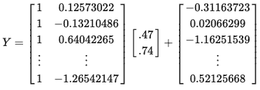
Now we use numpy to create the YY values based on X, B, and ϵϵ. X @ B is numpy shorthand for matrix multiplication.
Y = X @ B + e
Y
array([ 0.25140313, 0.39290539, -0.21860263, 0.43823025, -0.54935081,
0.37144666, 1.16283054, 1.01268983, 0.15505119, 0.0548448 ])
The first YY value, y1y1, is calculated as 1×0.47+0.12573022×0.74+−0.31163723=.251403131×0.47+0.12573022×0.74+−0.31163723=.25140313. The same pattern repeats for the subsequent rows.
Let’s plot the data. Because we used B=[.47,.74]B=[.47,.74] we expect the when the xx are close to zero the the yy values are close to .47, and that when xx increases by one the yy values increase by about .74.
import matplotlib.pyplot as plt
plt.plot(X[:,1:], Y, 'o')
plt.show()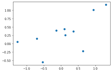
Performing Linear Regression
We have data, now let’s put it to use. Let’s make create a model that makes predictions for yy using XX. We’ll start with ordinary least squares linear regression. It’s one of the most basic and ubiquitous machine learning algorithms. And it can be done very easily using linear algebra.
OLS finds the coefficients ^BB^ for XX to make the best predictions for YY using the relationship ^Y=XT^BY^=XTB^. ^YY^ represents the predictions. XTXT does not mean X to the power of T. Rather, XTXT means the transpose of XX. Transposing XX means switching the rows and columns. So to predict Y, transpose the XX matrix and multiply it by the coefficient matrix ^BB^.
The common-sense way to define “best predictions” would be that the ^YY^ predictions should be as close as possible to YY. But there’s a more precise definition used in ordinary least squares regression. The best predictions minimize the sum of squared differences between the actual values of YY and the predicted values, ^YY^. It’s called ordinary least squares – because it finds the least possible value for the sum of the squared differences of yy and ^yy^. In matrix notation, you could write this as ∥∥Y−^Y∥∥2‖Y−Y^‖2.
Using calculus, it can be shown that the coefficients ^BB^ which minimize the sum of the squared differences of y and ^yy^ is
^B=(XTX)−1XTyB^=(XTX)−1XTy
So to find ^BB^ we simply use numpy to perform the calculations. We could do this using np.transpose and np.matmult, but it’s easier to read if we use the shorthand X.T instead of np.tranpose(X) and use X @ y instead of np.matmult(X,y).
B_hat = np.matmul(np.matmul(np.linalg.inv(np.matmul(np.transpose(X),X)),np.transpose(X)),Y)
B_hat
array([0.27090925, 0.427913 ])
from numpy.linalg import inv
B_hat = inv(X.T @ X) @ np.transpose(X) @ Y
B_hat
array([0.27090925, 0.427913 ])
^BB^ approximates BB, but because we introduced error and because we have only ten data points, the values aren’t that close. So our model doesn’t perfectly capture the relationship we used to create the data. You can go back to the previous step when we created the data and try adding more rows to the XX or using smaller values of ϵϵ and see that ^BB^ will tend to get closer to BB.
Y_hat = np.inner(X,B_hat)
Y_hat
array([ 0.32471084, 0.21437986, 0.54495442, 0.31579737, 0.04168936,
0.42564047, 0.82890781, 0.6761775 , -0.03022821, -0.27058105])
Plotting the Predicted Values
Let’s plot the actual and predicted x and y values. The regression line looks like a reasonable fit for the data.
plt.plot(X[:,1:], Y, 'o', label='actual')
plt.plot(X[:,1:], Y_hat, linestyle='-',marker='.', label='predicted')
plt.legend(loc='lower right')
plt.show()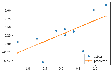
The same approach can apply to the multivariate case where there are nn predictors instead of just one. We would use a larger matrix, like this:

and a correspondingly larger matrices for BB and ^BB^.
Ridge Regression
Machine learning models must work well not only on the data used to train the model but on new data. A model that overfits the training data will not generalize to new data.
How to avoid overfitting the training data? Ridge regression is one option. Ridge regression applies a penalty to reduce the size of the regression coefficients, ^BB^. Instead of minimizing the sum of the squared prediction errors, we minimize the squared prediction errors with a penalty. Increasing the penalty reduces the size of the coefficients more dramatically.
The formula below gives the coefficients which minimize the penalized squared prediction errors. Notice that it is the same as the formula for linear regression, except for the addition of the λIλI term.
^B=(XTX+λI)−1XTyB^=(XTX+λI)−1XTy
We don’t want to apply a penalty to the intercept, only to the coefficient(s) for the predictor variables. So instead we begin by centering the x values and using the mean value of y as the y-intercept.
X_centered = X[:,1] - X[:,1].mean()
X_centered = X_centered.reshape(10,1)
We’ll discuss how to choose an optimal value for λλ later, but for now, we’ll set it to 3.
lambda_hyperparameter = 3
B_hat = inv(X_centered.T @ X_centered + lambda_hyperparameter * np.identity(1)) @ X_centered.T @ Y
B_hat
array([0.27678361])
Y_hat = Y.mean() + np.inner(X_centered,B_hat)
Y_hat
array([ 0.31850692, 0.24714239, 0.46096535, 0.31274149, 0.13544235,
0.38379044, 0.64463269, 0.54584334, 0.08892447, -0.06654107])
Trying different options for λ
We’ve tried an arbitary value for λλ and used it to create predictions. Now let’s try looping through four possible values of λλ using the variable lambda_hyperparameter and see how the regression line changes. Again, when we set λλ to zero we’re doing ordinary least squared regression.
lambda_hyperparameters = [0,1,3,10000]
B_hats = []
for count, lambda_hyperparameter in enumerate(lambda_hyperparameters):
    B_hat = inv(X_centered.T @ X_centered + lambda_hyperparameter * np.identity(1)) @ X_centered.T @ Y
    Y_hat = Y.mean() + np.inner(X_centered,B_hat)
    plt.plot(X[:,1], Y_hat, label='regression line using lambda = ' + str(lambda_hyperparameters[count]))
plt.legend(loc='lower right')
plt.show()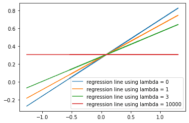
How do the predictions change as we increase lambda_hyperparameter? We see that as the values of lambda_hyperparameter increase, the values of the ^BB^ decrease. The slope of the regression line decreases, and the predicted values of ^YY^ get closer to the mean value of YY.
Choosing the best value for λλ using Cross Validation
So increasing lambda flattens the regression line. But how to choose the best value for lambda? We want a model which fits the training data as well as possible, while still generalizing to new data. We could use cross-validation to repeatedly subdivide the data into training and test and select the value for λλ with the best fit on the test data.
The code below iterates through six possible values of lambda. For each value of λλ, the code repeatedly creates models using different subsets of the data, then tests it on the part of the data that was not used to train the model. The squared errors on the test data are stored in test_ssr. Finally, we print out the average squared error on the test data for each λλ.
np.random.seed(0)
shuffled_indexes = np.random.choice(range(X_centered.shape[0]), size=X_centered.shape[0], replace=False).reshape(5,2)
for lambda_hyperparameter in [0,.5,1,2,3,4]:
    test_ssr = []
    for test_index in shuffled_indexes:
        train_index = np.setdiff1d(shuffled_indexes,test_index)
        B_hat = inv(X_centered[train_index].T @ X_centered[train_index]
                    + lambda_hyperparameter * np.identity(1)) @ np.transpose(X_centered[train_index]) @ Y[train_index]
        Y_intercept = Y[train_index].mean()
        Y_hat_test = Y_intercept + np.inner(X_centered[test_index],B_hat)
        test_ssr.append(np.sum((Y_hat_test - Y[test_index])**2))
    print('With lambda_hyperparameter is set to ' + str(lambda_hyperparameter)
          + ' the average sum of squared errors on the test folds is ' + str(sum(test_ssr)/len(test_ssr)) + '.')
With lambda_hyperparameter is set to 0 the average sum of squared errors on the test folds is 0.4679212725204434. With lambda_hyperparameter is set to 0.5 the average sum of squared errors on the test folds is 0.4621349621732283. With lambda_hyperparameter is set to 1 the average sum of squared errors on the test folds is 0.46317383331587203. With lambda_hyperparameter is set to 2 the average sum of squared errors on the test folds is 0.47338753647032616. With lambda_hyperparameter is set to 3 the average sum of squared errors on the test folds is 0.48658327426303727. With lambda_hyperparameter is set to 4 the average sum of squared errors on the test folds is 0.49950960664511107.
For this attempt, setting lambda_hyperparamter to .5 gives the lowest error on on the test folds when we do five-fold cross validation. This suggets that λλ=.5 is the best choice to avoid overfitting.
Principal Components Analysis
Now let’s look at using linear algebra to perform principal components analysis. This analysis belongs to a different category than linear regression. Linear regression is a type of supervised machine learning, while principal components analysis is unsupervised machine learning. Supervised machine learning uses features to predict a target variable. Unsupervised machine learning discovers patterns in the data but without using a target variable.
Principal Components Analysis is an unsupervised machine learning technique for dimension reduction. If you have many columns of continuous numeric data, using principal components analysis can allow you to reduce the number of columns while minimizing the loss of information in the data. This is particularly effective when the data is highly correlated. With highly correlated data, PCA can reduce the size of the dataset while preserving most of the information in the original.
In our example, we’ll be looking at a 2-dimensional case so that it’s easy to graph, but the same technique can reduce on a 100+ column dataset.
Standardizing the data
The columns in the data should be at the same scale. If they’re at different scales, the columns with a larger range will tend to have larger variance and hence be treated as more important when we compute the covariance matrix and determine the principal components.
XY = np.stack((X[:,1],Y),axis=1)
XY_standardized = (XY - np.mean(XY, axis=0)) / np.std(XY, axis=0)
XY_standardized
array([[ 0.05538105, -0.11477763],
[-0.29246387, 0.17658938],
[ 0.74975181, -1.08256553],
[ 0.02727918, 0.26991772],
[-0.83691213, -1.76360844],
[ 0.37358593, 0.13240376],
[ 1.64498306, 1.76194069],
[ 1.16346407, 1.45278626],
[-1.06364953, -0.31317571],
[-1.82141957, -0.5195105 ]])
Computing the Covariance Matrix
The covariance matrix will be used to calculate the eigenvectors and eigenvalues. The top left value indicates the variance of the xx values, while the bottom left value indicates the variance for the yy values. The top right and lower left values indicate the correlation between the xx and yy values.
covariance_matrix = np.cov(XY_standardized.T)
covariance_matrix
array([[1.11111111, 0.72568196],
[0.72568196, 1.11111111]])
Determining the Principal Components
The eigenvectors of the covariance matrix provide the directions of maximal variance, with the corresponding eigenvalues indicating the magnitude of the variance. The eigenvector with the largest eigenvalue is the first principal component. The first principal component points in the direction of the greatest variance in the data. The eigenvector with the second largest eigenvalue is the second principal component. It is orthogonal to the first principal component and points in the direction of the second largest variance of the data.
eigen_values, eigen_vectors = np.linalg.eig(covariance_matrix)
print(eigen_values)
print(eigen_vectors)
[0.38542915 1.83679307] [[-0.70710678 -0.70710678] [ 0.70710678 -0.70710678]]
inds = eigen_values.argsort()[::-1]
eigen_values = eigen_values[inds]
eigen_vectors = eigen_vectors[:,inds]
print(eigen_values)
print(eigen_vectors)
[1.83679307 0.38542915] [[-0.70710678 -0.70710678] [-0.70710678 0.70710678]]
The first principal component accounts for more than 82% of the variance in the data. So, if we wanted to use PCA to reduce the dimensionality of our data, we could represent our data using just the first principal component instead of using the original xx and yy values.
eigen_values[0] / np.sum(eigen_values)0.8265568819552345
Visualizing the Prinipcal Components
The principal components must be orthogonal to each other. To see this clearly, we need to have the xx and yy axis set to the same scale. If the axes are on different scales, the angle between the principal components will be distorted so it will appear not to be perpendicular. Use the set_aspect method with the equal argument to keep the axes on the same scale.
fig, ax = plt.subplots()
ax.plot(XY_standardized[:,0], XY_standardized[:,1], 'o')
ax.set_aspect("equal")
ax.annotate('',  eigen_vectors[:,0].T*eigen_values[0],(0,0) ,arrowprops={'arrowstyle':'simple'})
ax.annotate('',  eigen_vectors[:,1].T*eigen_values[1],(0,0) ,arrowprops={'arrowstyle':'simple'})
plt.show()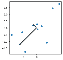
Transforming the Standardized Data Using the Principal Components
We can use matrix multiplication to transform the original data using the principle components.
transformed_data = XY_standardized @ eigen_vectors
transformed_data
array([[ 0.04199973, -0.12032035],
[ 0.08193564, 0.33167074],
[ 0.23533483, -1.29564402],
[-0.21014994, 0.17157135],
[ 1.83884573, -0.65527324],
[-0.35778874, -0.17054155],
[-2.40905889, 0.08270153],
[-1.84996836, 0.20458168],
[ 0.97356247, 0.53066513],
[ 1.65528753, 0.92058873]])
Plot the Transformed Data
Let’s plot the data before and after transformation. The large blue dots, representing the data before transform, go from the lower left to the top right of the graph. The small orange dots, representing the data after transformation, don’t show the same correlation between the xx and yy values.
plt.plot(XY_standardized[:,0], XY_standardized[:,1], 'o', label='standardized')
plt.plot(transformed_data[:,0], transformed_data[:,1], '.', label='standardized and pca transformed')
plt.legend(loc='lower right')
plt.show()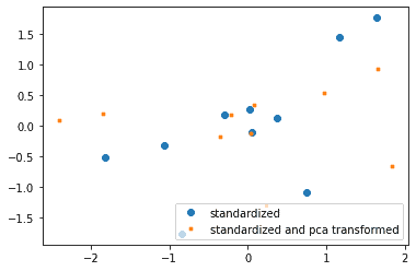
Confirm that we get the same results using scikit-learn
We used numpy to demonstrate the linear algebra, but now we can use scikit-learn and confirm that the PCA method gives the same results. The principcal components are the same, except that the econd principal component has opposite sign.
from sklearn.decomposition import PCA
from sklearn import preprocessing
scaler = preprocessing.StandardScaler().fit(XY)
XY_standardized = scaler.transform(XY)
pca = PCA(n_components=2)
pca = pca.fit(XY_standardized)
xy_transform = pca.transform(XY_standardized)
print(pca.components_)
[[ 0.70710678 0.70710678] [ 0.70710678 -0.70710678]]
pca.explained_variance_ratio_array([0.82655688, 0.17344312])
Because the principal components have the opposite sign, the transformed values also have the opposite signs. Except for the difference in sign, scikit-learn and numpy’s linear algebra methods give the same results.
xy_transformarray([[-0.04199973, 0.12032035],
[-0.08193564, -0.33167074],
[-0.23533483, 1.29564402],
[ 0.21014994, -0.17157135],
[-1.83884573, 0.65527324],
[ 0.35778874, 0.17054155],
[ 2.40905889, -0.08270153],
[ 1.84996836, -0.20458168],
[-0.97356247, -0.53066513],
[-1.65528753, -0.92058873]])
As we saw earlier, the first prinipal component accounts for more than 82% of the variance.
print(pca.explained_variance_ratio_)[0.82655688 0.17344312]
Summary
We’ve used linear algebra to create a small simulated dataset, then we’ve created predictive models for that dataset using ordinary least squares regression and ridge regression. We’ve then used principal component analysis to show how we could transform the original data to one dimension while keeping 82% of the variance in the original data. These are just examples – linear algebra is fundamental to machine learning, so the algorithm for almost any machine learning technique will use linear algebra. That includes more complex techniques like neural nets, support vector machines, and recommender systems.


